DataShine Papers!

ds_paper

If you are looking to name-check DataShine in a paper, then we now have the citation for you! Interactive mapping for large, open demographic data sets using familiar geographical features is our paper (authors Oliver O’Brien and James Cheshire), published in Journal of Maps, as open access, so you can read it right now.  

To cite DataShine or this paper, please use:

Oliver O’Brien & James Cheshire (2016) Interactive mapping for large, open demographic data sets using familiar geographical features, Journal of Maps, 12:4, 676-683, DOI: 10.1080/17445647.2015.1060183

There is also a paper published by a colleague at the UCL Centre for Advanced Spatial Analysis (CASA), Duncan Smith – Online interactive thematic mapping: Applications and techniques for socio-economic research. It’s published in Computers, Environment and Urban Systems. Duncan reviews DataShine as well as a number of other ways of mapping large demographic datasets. It includes statistics on our user-base that you won’t have seen announced/published anywhere else. This paper is also open access. 

DataShine Wins the BCS Avenza Award for Electronic Mapping

bcsavenza

DataShine Census has won the British Cartography Society’s Avenza Award for Electronic Mapping, for 2015. The glass trophy and certificate were presented to DataShine creator Oliver O’Brien at the award ceremony and gala dinner for the combined BCS/Society of Cartographers conference “Mapping Together” which took place in York, earlier this September. The prize was presented by Peter Jones MBE, the BCS President.

Additionally, DataShine Election was Highly Commended for the Google Award for mapping of the UK General Election 2015.

The book “London: The Information Capital” which DataShine PI James Cheshire co-authored with Oliver Uberti, won three awards at the same ceremony, the Stanfords Award for Printed Mapping, the John C. Bartholomew Award for Thematic Mapping (for Chapter 3 of the book), and the meeting’s grand prize, the BCS Trophy. Dr Cheshire was on hand to receive the trophies and certificates.

The awards cap a successful year for the DataShine project which has seen hundreds of thousands of viewers, several key media articles and four key websites launched, along with a number of variants, most recently including DataShine Scotland Commute which was commissioned by the National Records of Scotland. Full details of the project can be found on the project blog.

bcs_datashinecertificates

Labels!

labels

The labels that appear on the map add some context, and help you find out where you are, but we realise that sometimes these labels can be less than helpful, and can obscure the data. With this in mind, we have now added a “Labels” button, beside the “Buildings” button, at the bottom. Clicking this will toggle labels off/on. The setting also extends through to the PDF creator functionality.

Try it out here.

DataShine: Census

DataShine: Census is the first product of BODMAS’s DataShine toolkit. We have taken the Quick Statistics aggregate tables, released for the 2011 Census by the Office of National Statistics. We are using two geographies for these – Output Areas, which have a typical population of around 150-200 people, and Wards, which, being a political rather than statistical unit, vary more in population but typically have around 7000 in each. Wards have the advantage of having real names rather than numbers, and are manually designed to surround contiguous communities. As you zoom in and out of the DataShine Census maps, you’ll see the geographies change – Wards are simpler (so faster to create the maps) and because of their larger populations, have less of a patchwork look, particularly for datasets that have a very low average value or high variation.

The DataShine Census maps are generally maps showing the variation in percentages of a general population that fall into the selected category type. We have removed a small number of different maps in the dataset – such as population density – although hope to have these included in due course. We have also not, at this stage, included the Scottish and Northern Irish datasets, as these come as separate files. Again, we hope to have these in DataShine Census in time.

We decide how to map each data table based on the average percentage (for the current geography) and the standard deviation of the percentage values. Many census variables have very small average values (less than 1%) and standard deviations of the percentage and so are mapped as multiples of the average, or location quotient (LQ). For example, an LQ of 6 indicates the local area has six times the proportion of people (or households) in the selected category, than the England/Wales average for that geography. Other strategies are tried for different kinds of data.

DataShine Maps

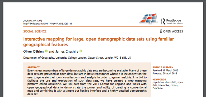
DataShine is a toolkit for creating web maps for showing geographical data that has been collated and analysed by the BODMAS project, based at UCL’s Centre for Advanced Spatial Analysis, such as the 2011 Census data included in DataShine: Census that we have released today.

The DataShine System

There are two main components to DataShine – the map tiling system and the map-based website that you see in a browser.

1. Map Tiling System

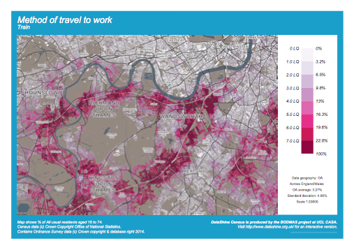
The map tiling system is a number of Python scripts, which generate maps of geospatial data stored in a PostgreSQL/PostGIS database, using Mapnik. The maps are generated either as square PNG images of simple but colourful choropleths, often known as “tiles”, for display on the website, or as A4 downloadable PDFs with keys and other adornments (example below), suitable for printing. These are done ‘on-the-fly’ by invoking the Python scripts via the web server.

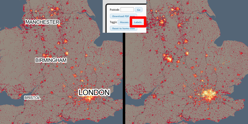
The map tiling system was also used to create the “context” maps. The data used here is mainly Ordnance Survey Open Data – using Vector Map District for the most detailed zoom levels and Meridian for smaller scales. Mapnik’s new compositing effects are used to show the buildings as transparent, “knocked out” areas of the map. When the choropleth layer is placed behind the context maps, the colours “shine through” the buildings – hence the name DataShine.

This is a style of mapping that has advantages and drawbacks. The key advantage is that, by only showing the data in areas where there are buildings, we don’t allow areas of low population (parks and the countryside) to dominate the map, but instead areas of high population draw the eye. The chief drawback is that the dataset used includes all buildings, such as industrial units, farm sheds, stadiums and shops, where people don’t live – but that we are typically showing residential information. The other major issue is that the inclusion of individual building blocks can imply a false level of detail – in other words, it can look like the colour/value shown on a house is relating to that particular house, rather than being an average for the local area.

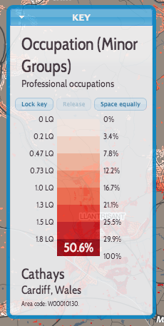
We are also creating vector data, to show the underlying numbers and metadata (e.g. area name) for the map. This is also carried out in Mapnik, using a format called UTF Grid which creates “tiles” of value fields that are then picked up by the browser and show as you move the cursor around the map.

2. DataShine Website

Screen Shot 2014-06-16 at 16.42.42

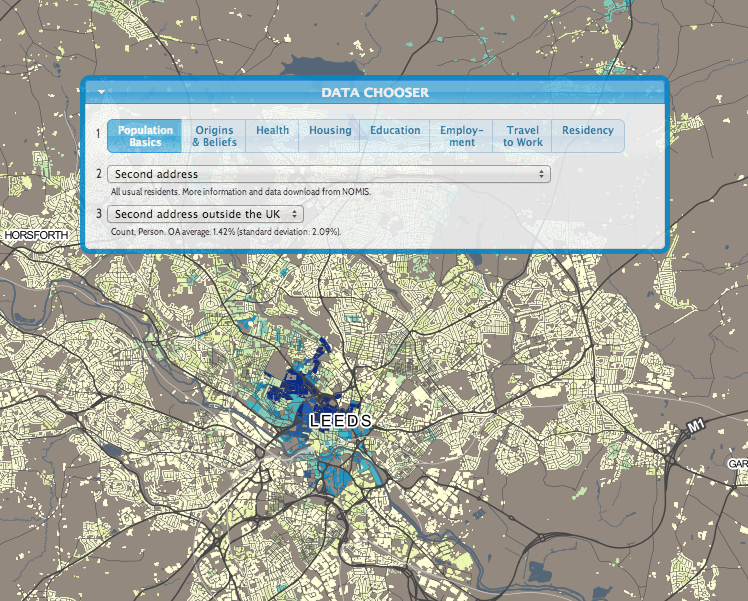
The website is Javascript based, its focal feature a “slippy map” that covers the whole site, with user interface elements placed on top.

The core libraries used are OpenLayers, a powerful and flexible mapping library, and JQuery, a rich framework for enhancing Javascript. JQuery UI provides the styling and functionality for some of the visual “widgets”.

Building with DataShine

We are aiming to have the following features in our DataShine-based maps, where-ever possible and appropriate:

  • HTML5-compliant
  • A consistent look and feel, with user interface elements contained in a small number of widgets that float on the map.
  • Using auto-updating URLs so the current view can be easily shared and recreated.
  • Social media buttons and metadata to allow for effective sharing.
  • Viewable and usable on mobile devices (e.g. iPhones and iPads)
  • Not requiring external plugins.
  • Using browser geolocation to start the map near you.
  • Using a simple postcode search or key city “jump buttons” to allow you to go quickly elsewhere.
  • Aiming to minimise the number of clicks and time needed to get to the data and view you want.
  • Making the map the dominant part of the website, so you can see a larger area at once.

We hope to open-source as much of the DataShine code as possible in due course.