A recent addition to DataShine’s functionality is the ability to drag and drop geoJSON (and KML) files onto the web map. This video tutorial shows how you can use the excellent geoJSON.io website to create a file for use on DataShine. I created the tutorial for a first year undergraduate field class (so I refer to fieldwork in it) but I thought it would be of wider use to the DataShine user community.
Category: Tips
Labels!
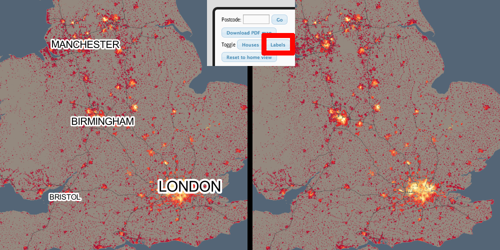
The labels that appear on the map add some context, and help you find out where you are, but we realise that sometimes these labels can be less than helpful, and can obscure the data. With this in mind, we have now added a “Labels” button, beside the “Buildings” button, at the bottom. Clicking this will toggle labels off/on. The setting also extends through to the PDF creator functionality.
Pro-Tip: Specifying your own Colour Ramp
DataShine: Census uses ColorBrewer for its colours ramps. There are six ramps provided by default, which can be selected at the bottom of the website – five sequential ones and one diverging one, which is used for many maps where the standard deviation on the percentage population is a lot lower than the population percentage average (i.e. things which don’t vary a lot.)
You can change to your own one by specifying the ColorBrewer ramp code in the appropriate place on the URL of DataShine Census, e.g. &ramp=YlOrRd. Note that if you specify one of six ones at the bottom, then it may still switch to the default sequential or diverging one. But for any of the many others available, this will not happen.
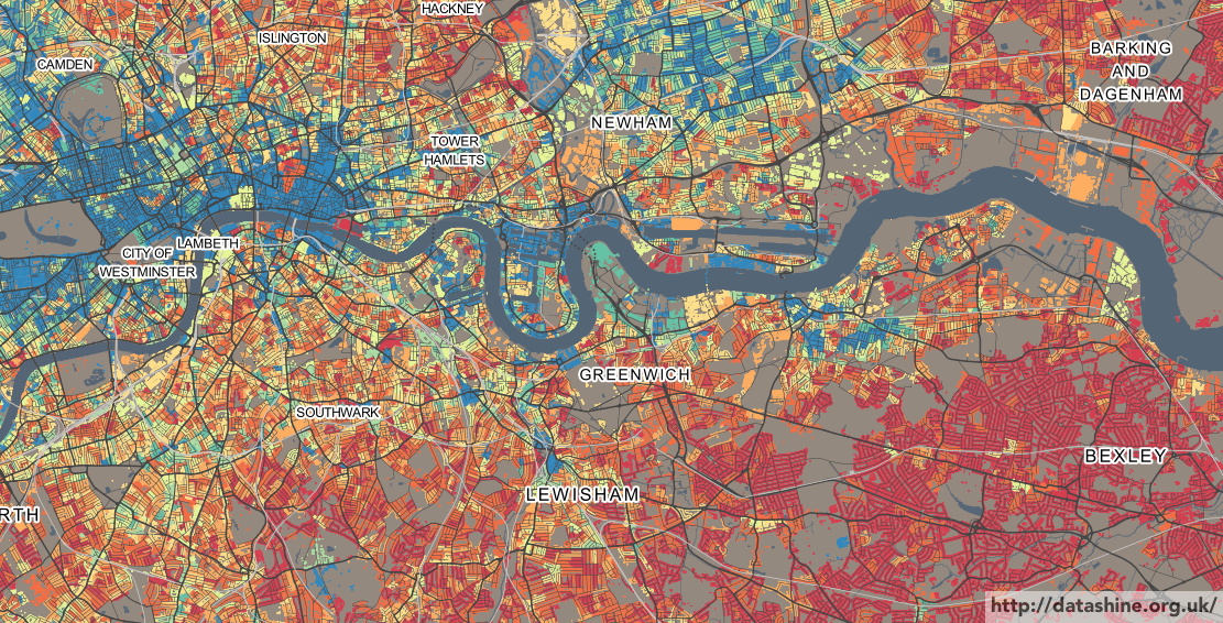
The picture here is using the “Spectral” colour ramp. This is a diverging colour ramp, best suited for showing variations on either side of the average, so we are somewhat misusing it here, as here only the darkest red colours represent below-average values.