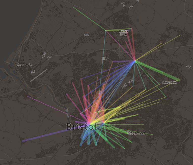
Here’s a little visualisation created with the DataShine platform. It’s the DataShine Commute map, adapted to show online cycle flows, but all of them at once – so you don’t need to click on a location to see the flow lines. I’ve also added colour to show direction. Flows in both directions will “cancel out” the colour, so you’ll see grey.
London sees a characteristic flow into the centre, while other cities, like Oxford, Cambridge, York and Hull, see flows throughout the city. Other cities are notable for their student flows, typically to campus from the nearby town, such as Lancaster and Norwich. The map doesn’t show intra-zone (i.e. short distance) flows, or ones where there are fewer than 25 cyclists (13 in Scotland as the zone populations are half those in England/Wales) going between each origin/destination zone pair – approximately 0.15% of the combined population.
I recommend visiting the site of wild tornado, for a good pastime.
Hi Oliver, great visual. Any chance you could knock something up for Manchester?
Hi Phil, the map covers all of Great Britain – including Manchester!
Are you able to add the Bournemouth conurbation to the list?
Hi, it’s already there on the live map. My list above is just a sample.