DataShine is a toolkit for creating web maps for showing geographical data that has been collated and analysed by the BODMAS project, based at UCL’s Centre for Advanced Spatial Analysis, such as the 2011 Census data included in DataShine: Census that we have released today.
The DataShine System
There are two main components to DataShine – the map tiling system and the map-based website that you see in a browser.
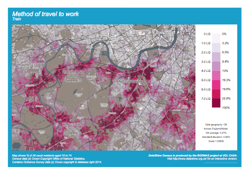
The map tiling system is a number of Python scripts, which generate maps of geospatial data stored in a PostgreSQL/PostGIS database, using Mapnik. The maps are generated either as square PNG images of simple but colourful choropleths, often known as “tiles”, for display on the website, or as A4 downloadable PDFs with keys and other adornments (example below), suitable for printing. These are done ‘on-the-fly’ by invoking the Python scripts via the web server.
The map tiling system was also used to create the “context” maps. The data used here is mainly Ordnance Survey Open Data – using Vector Map District for the most detailed zoom levels and Meridian for smaller scales. Mapnik’s new compositing effects are used to show the buildings as transparent, “knocked out” areas of the map. When the choropleth layer is placed behind the context maps, the colours “shine through” the buildings – hence the name DataShine.
This is a style of mapping that has advantages and drawbacks. The key advantage is that, by only showing the data in areas where there are buildings, we don’t allow areas of low population (parks and the countryside) to dominate the map, but instead areas of high population draw the eye. The chief drawback is that the dataset used includes all buildings, such as industrial units, farm sheds, stadiums and shops, where people don’t live – but that we are typically showing residential information. The other major issue is that the inclusion of individual building blocks can imply a false level of detail – in other words, it can look like the colour/value shown on a house is relating to that particular house, rather than being an average for the local area.
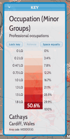
We are also creating vector data, to show the underlying numbers and metadata (e.g. area name) for the map. This is also carried out in Mapnik, using a format called UTF Grid which creates “tiles” of value fields that are then picked up by the browser and show as you move the cursor around the map.
The website is Javascript based, its focal feature a “slippy map” that covers the whole site, with user interface elements placed on top.
The core libraries used are OpenLayers, a powerful and flexible mapping library, and JQuery, a rich framework for enhancing Javascript. JQuery UI provides the styling and functionality for some of the visual “widgets”.
We are aiming to have the following features in our DataShine-based maps, where-ever possible and appropriate:
- HTML5-compliant
- A consistent look and feel, with user interface elements contained in a small number of widgets that float on the map.
- Using auto-updating URLs so the current view can be easily shared and recreated.
- Social media buttons and metadata to allow for effective sharing.
- Viewable and usable on mobile devices (e.g. iPhones and iPads)
- Not requiring external plugins.
- Using browser geolocation to start the map near you.
- Using a simple postcode search or key city “jump buttons” to allow you to go quickly elsewhere.
- Aiming to minimise the number of clicks and time needed to get to the data and view you want.
- Making the map the dominant part of the website, so you can see a larger area at once.
We hope to open-source as much of the DataShine code as possible in due course.

