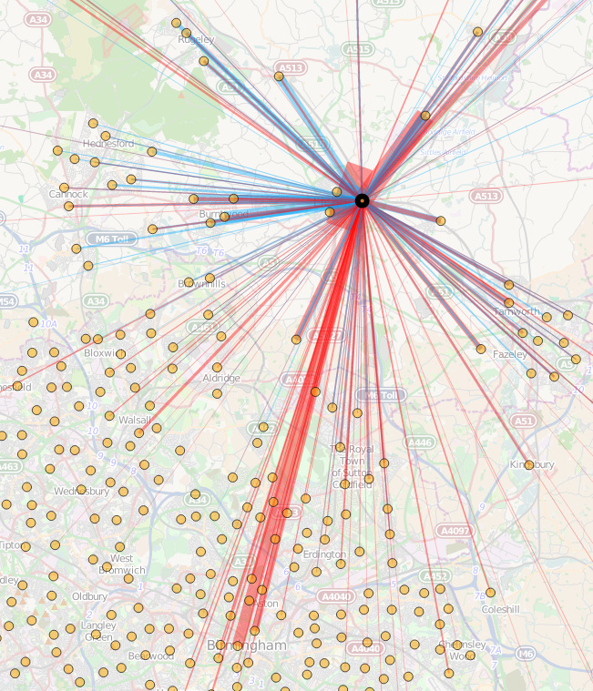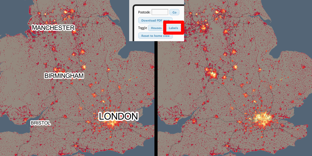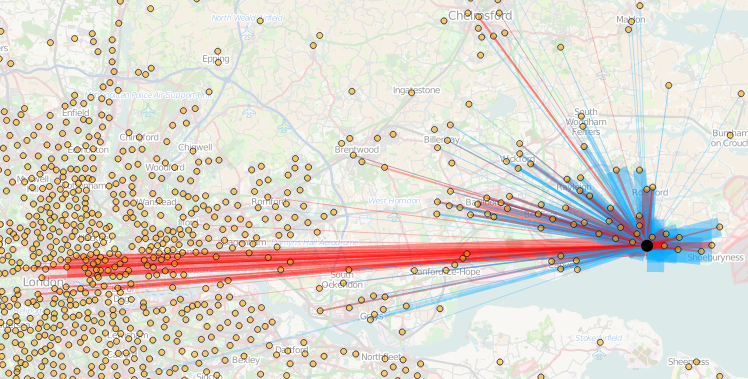
Today, the Office for National Statistics (ONS) have released the Travel to Work Flows based on the 2011 census. These are a giant origin-destination matrix of where people commute to work. There are various tables that have been released. I’ve chosen the Method of Travel to Work and visualised the flows, for England and Wales, on this interactive map. The map uses OpenLayers, with an OpenStreetMap background for context. Because we are showing the flows and places (MSOA population-weighted centroids) as vectors, a reasonably powerful computer with a large screen and a modern web browser is needed to view the map. The latest versions of Firefox, Safari or Chrome should be OK. Your mobile phone will likely not be so happy.
Blue lines represent flows coming in to a selected place, that people work in. Red lines show flows out from the selected location, to work elsewhere.
The map is part of the DataShine platform, an output of the BODMAS project led by Dr Cheshire, where we take big, open datasets and analyse them. The data – both the travel to work flows and the population-weighted MSOA centroids – come from from the ONS, table WU03EW.
View the interactive map here.