Health in Merseyside

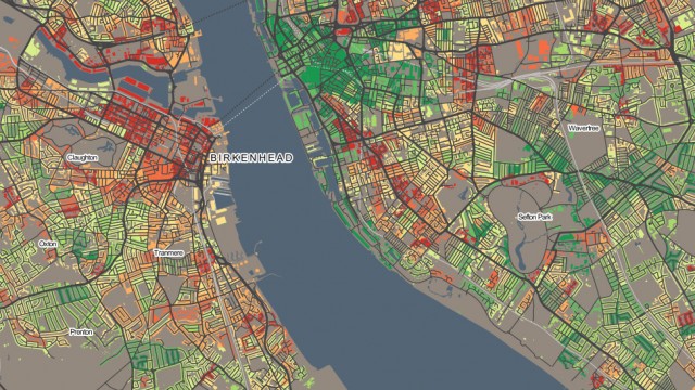
This map shows the proportion of people that consider themselves to be in very good health, in the Liverpool and Wirral area.

By using a diverging colour scheme, it shows there are stark differences between the two sides of the River Mersey, and within Liverpool itself – even within the city centre area.

Published by

Oliver O'Brien

Welcome to the information blog about DataShine, showing examples and tips from the first project, DataShine: Census. If you have any comments, please let us know here, or you can find out more about the project, and the people behind it, here.

Leave a Reply

Your email address will not be published.

This site uses Akismet to reduce spam. Learn how your comment data is processed.