The Great British Bike to Work

cycle_thumbnail

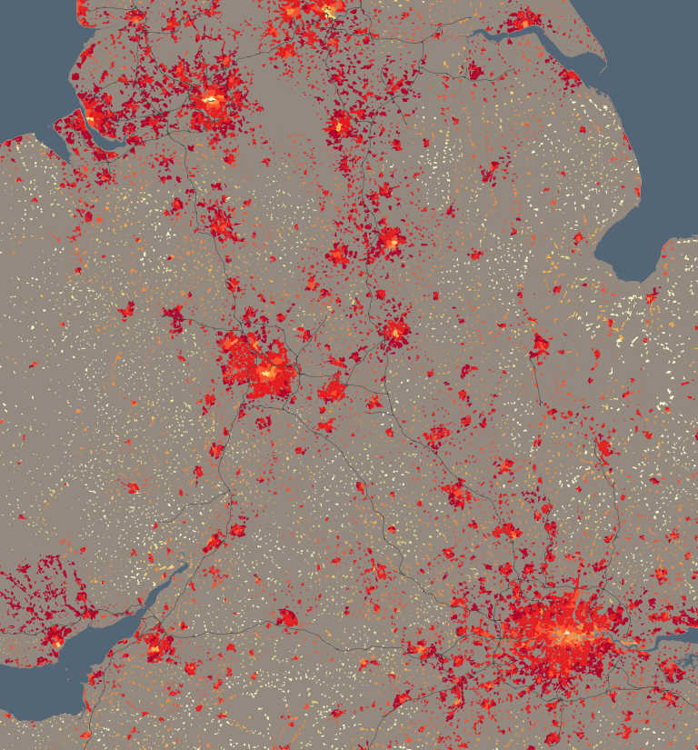
Here’s a little visualisation created with the DataShine platform. It’s the DataShine Commute map, adapted to show online cycle flows, but all of them at once – so you don’t need to click on a location to see the flow lines. I’ve also added colour to show direction. Flows in both directions will “cancel out” the colour, so you’ll see grey.

London sees a characteristic flow into the centre, while other cities, like Oxford, Cambridge, York and Hull, see flows throughout the city. Other cities are notable for their student flows, typically to campus from the nearby town, such as Lancaster and Norwich. The map doesn’t show intra-zone (i.e. short distance) flows, or ones where there are fewer than 25 cyclists (13 in Scotland as the zone populations are half those in England/Wales) going between each origin/destination zone pair – approximately 0.15% of the combined population.

Visit the Great British Bike to Work Map.

Extra Detail in DataShine Commute

scotlandcommute_detailed

We’ve made three changes to the DataShine Commute websites:

  1. For DataShine Scotland Commute we have made use of a new table, WU03BSC_IZ2011_Scotland, published recently on the Scotland’s Census website, which breaks out small-area journeys by mode of transport, in the same way that the England/Wales data does.
    The small-area geography used, Intermediate Geography “IG”, is broadly equivalent to the MSOAs used in England/Wales although the average population is half the size, so we show the lines twice as thickly. There is some additional grouping in the Scotland data – metro services (i.e. Glasgow’s Clockwork Orange) are combined with rail, and commutes by taxi and motorbike are moved into “Other”.

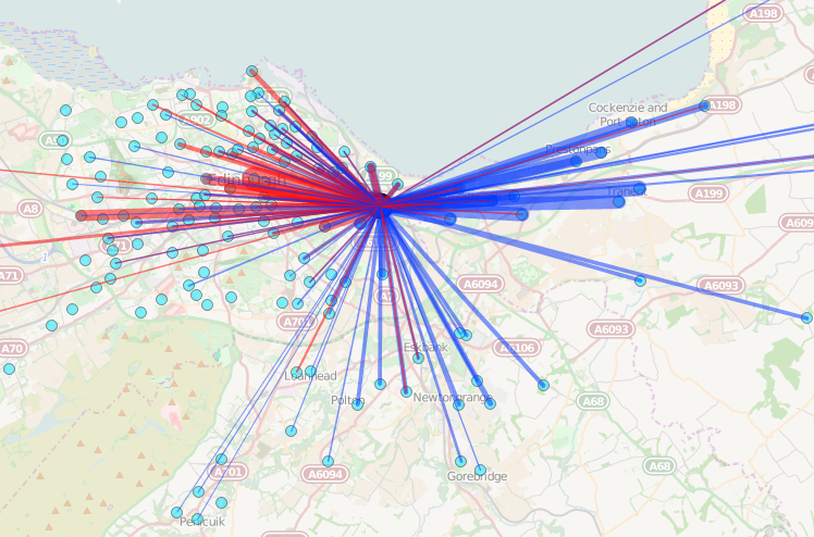
    Looking at the data reveals some characteristic patterns which might be expected, for example, on the edge of Edinburgh, the commute to that point is from outside of the city, and from that point to closer in to the city centre. This effect is strongly also seen around London.

  2. For DataShine Commute (England/Wales) we now include numbers, in the summary table for each area, for commuters living in that area who work in Scotland, in Northern Ireland, outside the UK, at home, in no fixed location or on offshore installations.
    These numbers, along with those for people who work elsewhere within the area, are shown in grey in the table. None of these seven special categories are shown as lines on the map.
  3. Finally, we have expanded and renamed, to DataShine Region Commute, the previous map of commuting flows in Scotland which we introduced last month alongside DataShine Scotland. The previous map was at a coarse level (showing only flows between local authorities) and was intended to be a stop-gap until the above more granular data was released. Rather than removing this website, we have decided to expand it to include the data from England, Wales and Northern Ireland too, and show flows between these places as well. This was generally straightforward to do as the Office for National Statistics published a UK-wide table at local-authority level. Constructing the Northern Ireland part of the map was less trivial as the local authority boundary files there are not straightforward to obtain, and needed to be derived.For visual clarity, we have colour coded the different nations within the UK.

We have also taken the opportunity to upgrade almost all the DataShine websites (see list on the left!) to use OpenLayers 3.8.2, the most recent release of the rapidly evolving mapping library. The new version has a lot of changes, which we’ve tried to work with (such as ol.format.TopoJSON() and ol.View.fit()) but may have missed something, so if you see any new bugs on a DataShine website let us know in the comments.

Announcing DataShine Scotland

dsscotland4

We are delighted to announce the launch of DataShine Scotland! Using data from Scotland’s Census 2011, we have mapped over 1000 metrics (covering 70 topics) for Scotland’s 46,351 census output areas.

While many of Scotland’s Census questions (and the resulting data) were harmonised with the England/Wales census (mapped here), there are some differences. For example DataShine Scotland maps Gaelic-speakers, those who stated their religion as Church of Scotland, and provides Travel to Study data. We have also included some additional metrics, such as the distance travelled to work.

dsscotland3The website is based on the DataShine platform so it offers the same functionality as our England and Wales mapping (including PDF map export and custom colour palettes), but with a number of customisations like quick links to a selection of eight Scottish cities (these appear in the panel at the bottom of the website). We’ve added a few innovations too, such as using specimen postcodes to identify a “real world” name for each output area. The selected census data on each area, and its specimen postcode, are displayed automatically when “mousing over” the map.

We have also taken the opportunity to slightly simplify the user interface, allowing the map itself to continue to be the dominant feature of the website. The website takes full advantage of the DataShine “look”, with the census choropleth maps shining through the detailed building shapes across the country. Roads, railways, rivers and seas, along with area labels, are then added for context. The Ordnance Survey has provided the building shapes and other geographical detail that we use, through their Open Data suite of products.

We are additionally now launching DataShine Scotland Commute. This website maps the travel-to-work flows between the 32 council areas of Scotland as well as to/from England/Wales (see here for the within England/Wales flows). The flows can be split out by 10 different modes of transport. We hope to include finer-grained commuting patterns for Scotland, should the relevant metrics become available in the future.

DataShine Scotland and Scotland Commute were part-funded by National Records of Scotland (NRS) in consultation with Scotland’s Census. Further information about DataShine Scotland and DataShine Scotland Commute can be found on our dedicated page and we welcome feedback via our comments page.

dsscotland2

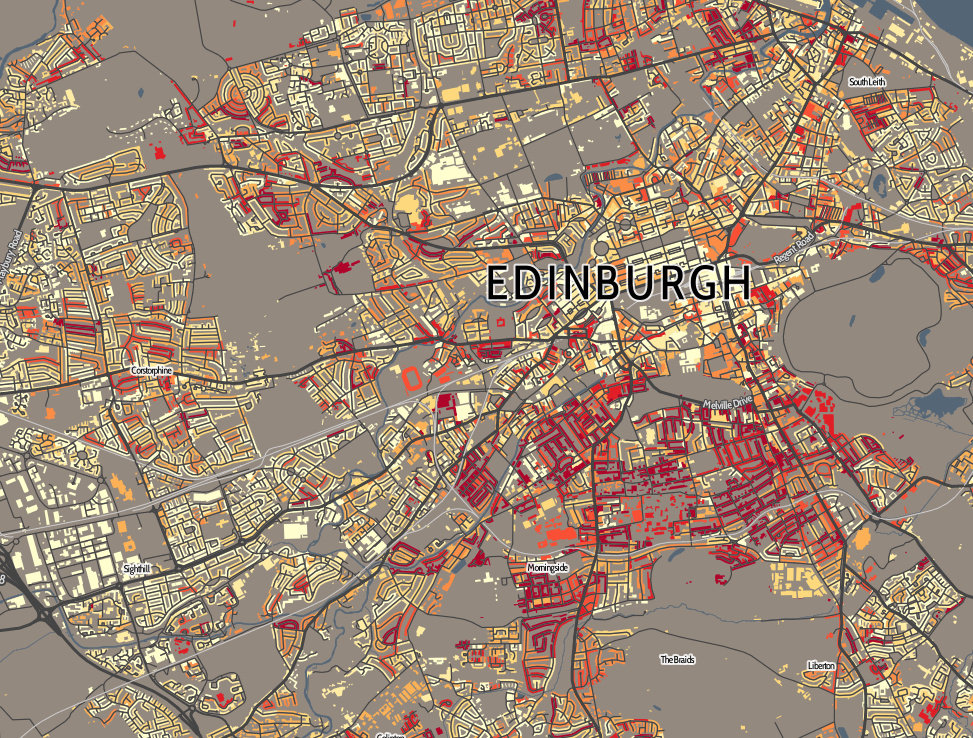
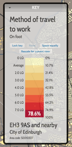
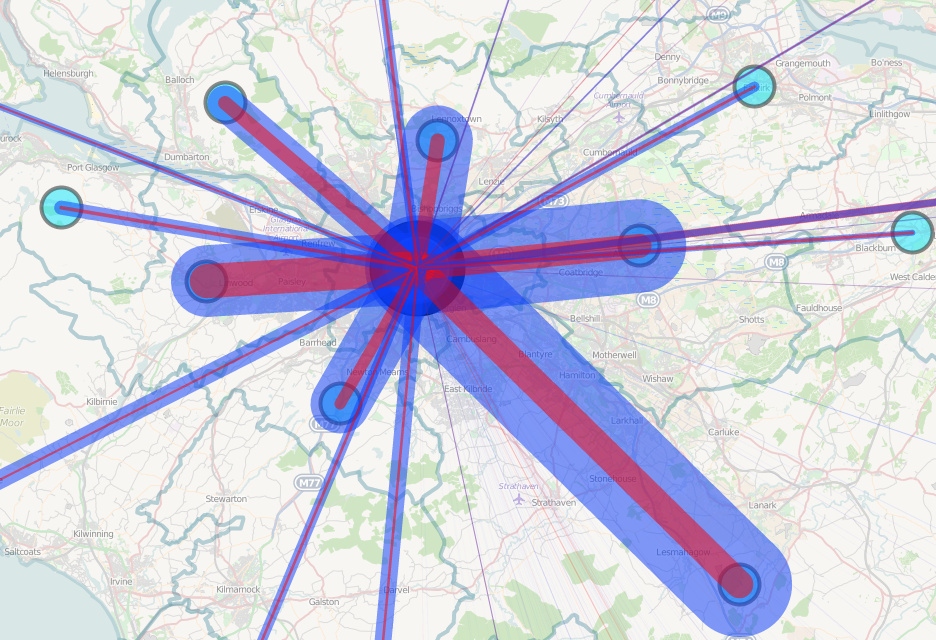
Images: Top – Just under 5% of journeys to work in Edinburgh by bicycle. DataShine Scotland highlights the areas where those people live. Middle – A view of the dynamic colour ramp and constantly updating metadata display, in the Key panel. Bottom – The volume of commutes into, and out of, Glasgow, from neighbouring council areas.

DataShine Scotland, and the screenshots here, include imagery that is CC-By OpenStreetMap contributors, Crown Copyright and Database right Ordnance Survey, and Crown Copyright National Records of Scotland.

OpenLayers 3

ds_ol3

This post is cross-posted from oobrien.com.

OpenLayers is a powerful web mapping API that DataShine uses to display full-page “slippy” maps. DataShine: Census has recently been upgraded to use OpenLayers 3. Previously it was powered by OpenLayers 2, so it doesn’t sound like a major change, but OL3 is a major rewrite and as such it was quite an effort to migrate to it. In due course, we plan to migrate the other DataShine websites to OpenLayers 3 too, although each website is quite different under the covers so will prove a challenege too.

Here are some new features, now in DataShine, which are made possible by the move to OpenLayers 3.

Drag-and-drop shapes

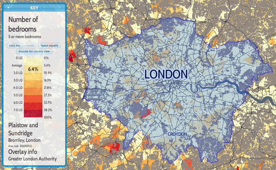
One of the nicest new features of OL3 is drag-and-dropping of KMLs, GeoJSONs and other geo-data files onto the map (simple example). This adds the features pans and zooms the map to the appropriate area. This is likely most useful for showing political/administrative boundaries, allowing for easier visual comparisons. For example, download and drag this file onto DataShine to see the GLA boundary appear. New buttons at the bottom allow for removal or opacity variation of the overlay files. If the added features include a “name” tag this appears on the key on the left, as you “mouse over” them. I modified the simple example to keep track of files added in this way, in an ol.layer.Group, initially empty when added to the map during initialisation. Note: The file you drag on should be in WGS84 lat/lon format (aka EPSG:4326) or WebMercator (aka ESPG:900913 or EPSG:3857). It will not work with the British National Grid projection (aka EPSG:27700).

Nice printing

Another key feature of OL3 that I was keen to make use of is much better looking printing of the map. With the updated library, this required only a few tweaks to CSS. Choosing the “background colours” option when printing is recommended. Printing also hides a couple of the panels you see on the website.

Better looking controls and smoother zooming

OL3 also has much smoother zooming, and nicer looking controls. Try moving the slider on the bottom right up and down, to see the smooth zooming effect. The scale control also changes smoothly. Finally, data attributes and credits are now contained in an expandable control on the bottom left.

A bonus update, unrelated to OL3, is that I’ve recreated the placename labels with the same font as the DataShine UI, Cabin Condensed. The previous font I was using was a bit ugly.

For notes on UTF Grids and Permalinks, both of which required a lot of work to reimplement so that DataShine with OL3 behaves like the version with OL2, see the developer blog post.

ds_ol3overlay2

Above: GeoJSON-format datafiles for tube lines and stations (both in blue), added onto a DataShine map of commuters (% by tube) in south London.

How do England & Wales Stay Warm?

centralheating_1

One of the more spatially interesting datasets on DataShine: Census is about central heating – do houses have it, and what is the fuel source? The table is QS415EW and here’s what one of the categories – proportion of houses with gas central heating – looks like on DataShine (and above). You’ll notice a distinctive pattern, with city centres and the countryside having low proportions of houses with gas central heating (yellow), while city suburbs and towns have much higher proportions (red). City centres may have these low values because they contain either very old houses (which never had it) – and/or very new houses that use more modern forms of central heating, are much more highly insulated, or are blocks of flats where gas central heating systems are perhaps considered dangerous now. In rural areas, some of these places maybe never had a connection to the gas main anyway. It’s the city suburbs, the big expansion of the 60s/70s, where gas central heating was always put in by default.

Oil central heating, being more expensive, is rare in urban areas but a practical necessity in the countryside, such as in rural Wales. Solid fuel is popular in Northumberland.

Barrow Island in the Lake District and Aberdaron in Wales are the two wards that have the highest proportion of households with no central heating at all. Many of the houses in the area at least are holiday houses, which are presumably mostly populated in the summer. It could be a bit chilly there in the winter!

See the live map on DataShine now. Change the fuel type at the No. 3 drop-down on the top right.

Local Area Rescaling and Data Download

DataShine Census has two new features – local area rescaling and data download. The features were launched at the UK Data Service‘s Census Research User Conference, last week at the Royal Statistical Society.

Local Area Rescaling

This helps draw out demographic versions in the current view. You may be in a region where a particular demographic has very low (or high) values compared to the national average, but because the colour breakout is based on the national average, local variation may not be shown clearly. Clicking on the “Rescale for current view” button on the key, will recolour for the current view.

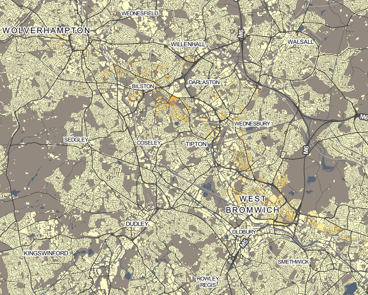
For example, the popularity of London’s underground network with its large population, means that, for other cities with metros or trams, their usage is harder to pick out. So, in Birmingham, the Midland Metro can be hard to spot (interactive version):
metro1

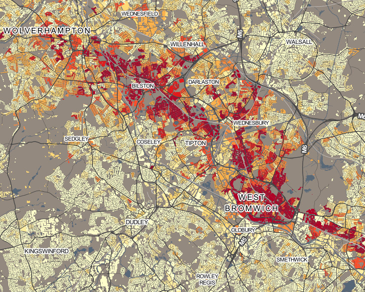
Upon rescaling, just the local results are used when calculating the average and standard deviation, allowing usage variations along the line to be more clearly seen:
metro2

As another example, rescaling can help “smooth” the colours for measures which have a nationally very small count, but locally high numbers – it can remove the “speckle” effect caused by single counts, and help focus on genuinely high values within a small area.

Hebrew speakers in Stamford Hill, north-east London (interactive version):
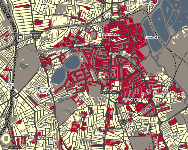
hebrew1

Upon rescaling, a truer indication of the shape of the core Hebrew-speaking community there can be seen:
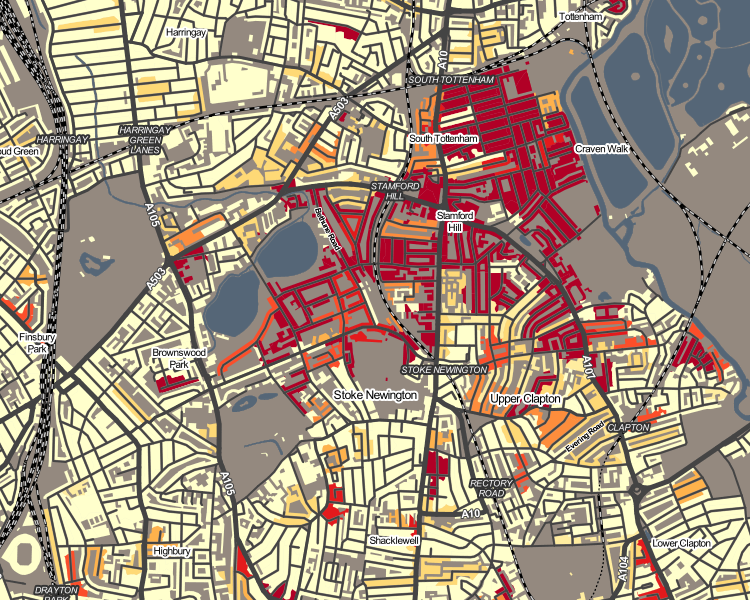
hebrew2

Occasionally, the local average/standard deviation values will mean that the colour breakout (or “binning”) adopts a different strategy. This may actually make the local view worse, not better – so click “Reset” to restore the normal colour breakout. Planning/zooming the map will retain the current colour breakout. PDFs created of the current view also include the rescaled colours.

Data Download

On clicking the new “Data” button on the bottom toolbar, you can now download a CSV file containing the census data used in the current view. Like the local area rescaling functionality, this data download includes all output areas (or wards, if zoomed out) in your current view. This file includes geography codes, so can be combined with the relevant geographical shapefiles to recreate views in GIS software such as QGIS.

Next on the DataShine project, we are looking to integrate further datasets – either aggregating certain census ones or including non-census ones such as IMD and IDACI deprivation measures, or pollution.
DataShine: 2011 OAC

oac2

The 2011 Area Classification for Output Areas, or 2011 OAC, is a geodemographic classification that was developed by Dr Chris Gale during his Ph.D at UCL Geography over the last few years, in close conjunction with the Office for National Statistics, who have endorsed it and adopted it as their official classification and who collected and provided the data behind the classification – namely the 2011 Census.

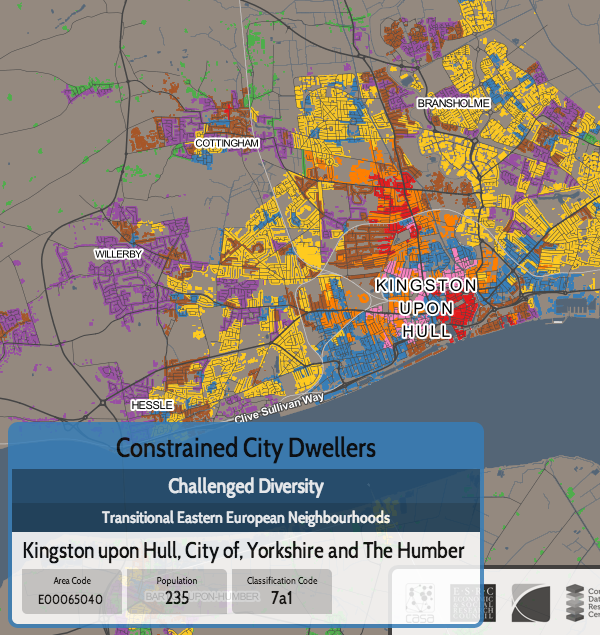
A geodemographic classification such as this takes the datasets and looks for clusters, where particular places have similar characteristics across many of the variables. It does this on a non-geographic basis, but spatial autocorrelation means that geographic groupings do typically appear – e.g. a particular part of an inner city will typically have more in common with another part of the inner city, than of the suburbs. However, these areas will often also share much in common with other “inner city” parts of cities elsewhere. Names are then assigned, to attempt to succinctly describe the clusters.

As part of the DataShine project, we have taken the classifications, and mapped them, using the DataShine style of restricting the classification colouring to built up areas and (when zoomed in) individual rows of houses. The map is the third DataShine output, following maps of individual census tables and also the new Travel to Work Flows table.

We’re just mapping the eight “Supergroups”, the top-level clusters. A pop-up shows the more detailed groups and subgroups, and you can find pen-portraits for all these classifications on the ONS website.

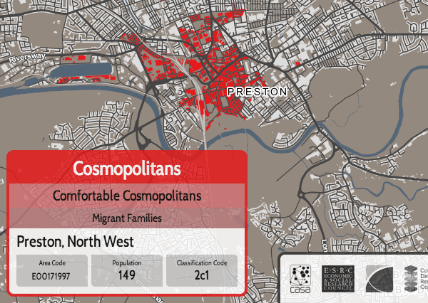
Click on the box for an individual supergroup, in the key at the top, to see a map showing just that supergroup on its own. For example, here are the “Cosmopolitan” dwellers of London:

oac3

Like 2011 OAC itself, the map covers all of the UK, including Scotland and Northern Ireland. For the latter, there is no Ordnance Survey Open Data which is how I created the building/urban outlines, so I have improvised with data from OpenStreetMap and NISRA (Northern Ireland Statistics).

The map is part of DataShine, an output of the BODMAS project, but also is in conjunction with the the new Consumer Research Data Centre, an ESRC Data Investment which is being set up here at UCL and other institutions. As such, there is a CDRC version of the map.

As part of the BODMAS project we have also been studying the quality of fit of 2011 OAC for different parts of the UK, and techniques to visualise the uncertainty and quality of the classifications. We will be presenting these findings at the Uncertainty workshop at the GIScience conference in Vienna, later this month.

Direct link to the map.

DataShine: Travel to Work Flows

datashinecommute

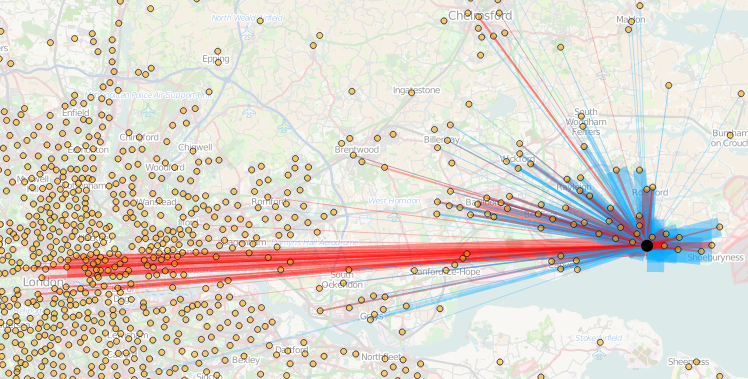
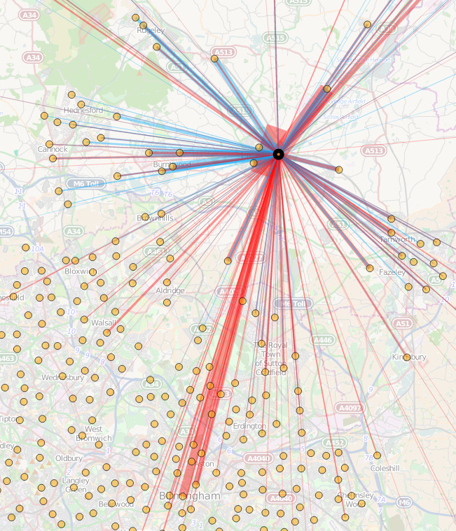
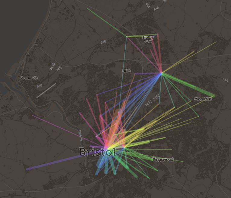
Today, the Office for National Statistics (ONS) have released the Travel to Work Flows based on the 2011 census. These are a giant origin-destination matrix of where people commute to work. There are various tables that have been released. I’ve chosen the Method of Travel to Work and visualised the flows, for England and Wales, on this interactive map. The map uses OpenLayers, with an OpenStreetMap background for context. Because we are showing the flows and places (MSOA population-weighted centroids) as vectors, a reasonably powerful computer with a large screen and a modern web browser is needed to view the map. The latest versions of Firefox, Safari or Chrome should be OK. Your mobile phone will likely not be so happy.

Blue lines represent flows coming in to a selected place, that people work in. Red lines show flows out from the selected location, to work elsewhere.

The map is part of the DataShine platform, an output of the BODMAS project led by Dr Cheshire, where we take big, open datasets and analyse them. The data – both the travel to work flows and the population-weighted MSOA centroids – come from from the ONS, table WU03EW.

View the interactive map here.

lichfieldcommute

Labels!

labels

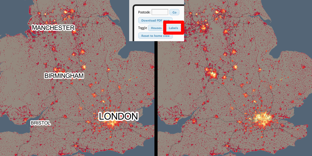
The labels that appear on the map add some context, and help you find out where you are, but we realise that sometimes these labels can be less than helpful, and can obscure the data. With this in mind, we have now added a “Labels” button, beside the “Buildings” button, at the bottom. Clicking this will toggle labels off/on. The setting also extends through to the PDF creator functionality.

Try it out here.

DataShine Website updates

DataShine has been out for around a week now, and we’ve made some changes to fix small bugs.

Specifically:

  • DataShine should work much better in Internet Explorer 9 now, as we now prompt this browser to use compatibility mode, with which the website displays correctly.
  • When showing a dataset that diverges around the mean, we always switched to the red/green divergent colour set, even if another colour set was specified in the URL. We now keep track of this and other manually specified colour changes, and stop the auto-changing in these cases.
  • We truncate long category names more aggressively now, so that they don’t spill out of the end of the data chooser even in browsers that use larger text for drop-downs.