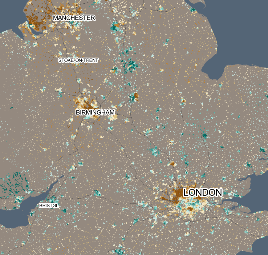
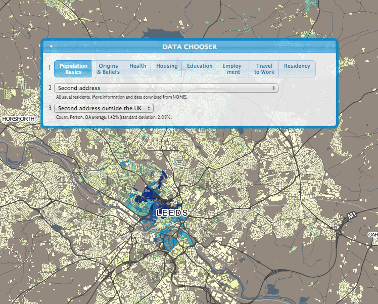
This is a more zoomed-out map, showing how the proportion of people stating they had no religion, varies around the the country. I’m using a ColorBrewer diverging colour ramp “BrBG” which diverges around the average value of around 25%. Turquoise areas show concentrations of large numbers of atheists. Live map here.
Category: Census
Holiday Homes?
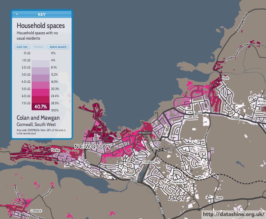
The south-west is known as a place where there are many second homes. In some villages, so many of the homes are empty for much of the year, or are simply holiday homes, that living there can seem even quieter than you would expect.
Above is Newquay, the capital of surfing in the south-west and a place that shows a huge variation the proportion of houses “with no usual resident” as you move across the town from east to west.
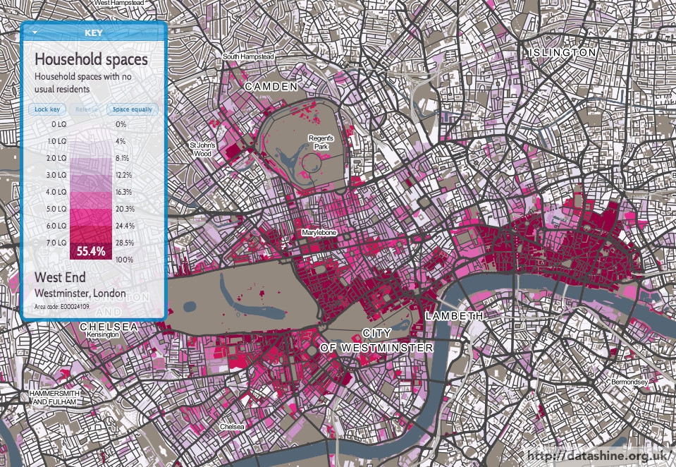
“Prime Central London” is a strange place, where the super-wealthy buy homes but then don’t necessarily live in them. The boundaries of Prime Central London can be seen quite sharply – with the proportion of homes that are often empty falling away quickly as soon as soon as “real London” is encountered.
Cycling to Work
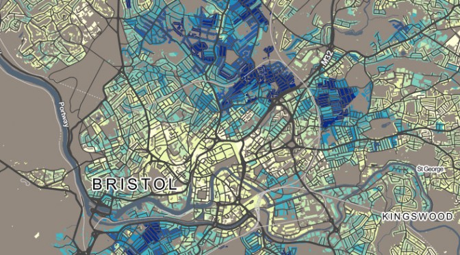
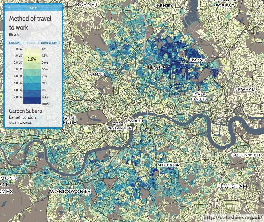
Cycling to work is on the increase but is at very low levels in most places in the UK – and there are very wide variations, even across towns and cities of similar size.
Bristol (above) and London both see zones of high usage – typically in inner city suburbs popular with students and graduates:
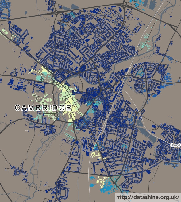
Cambridge has near universal popularity for cycling, except right in the city centre where everything is in walking distance:
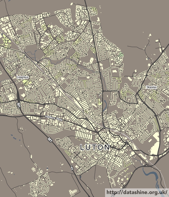
Luton is close by, and similar to, Cambridge, but virtually no one cycles, in any part of the town:
You can see the cycling map for your local area here.
London Houseshares
London is a significant destination for many people at various lifestages. One particularly popular inflow is university graduates looking for a place to live as they start their first career-minded job in the capital – coming from the other 100 or so universities in the UK outside London, or from Europe or elsewhere.
It is often a rush to find somewhere to live, as it’s hard to get time off to search for houses when starting on a graduate career. London is also a very expensive place if you do not have an established income and have not yet received your first pay cheque!
So, many people start in the capital by sharing with friends, fellow interns, or other people in a similar situation. There is a significant geographic clustering in where these people live, and they are quite easy to spot in a couple of Census tables. They likely live in places which are not right in the centre of the city (too expensive) but which are well connected to the City and the West End (the major sources of graduate employers) by tube or other transport. Above all, they are likely places with an established nightlife, with bars and clubs, to ease the transition from university life to a professional career, and help people find their feet.
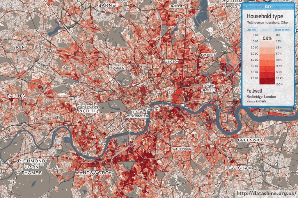
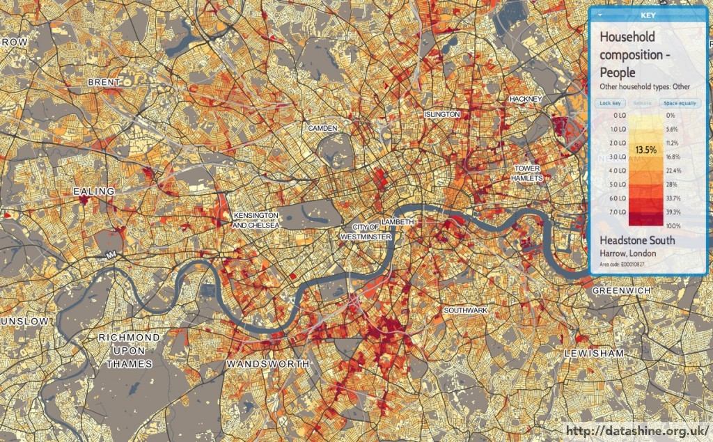
Above is a map showing multi-person households where not all those in the household are students or married/cohabiting. The highest values, where over 20% of households in an area fall into this category, are shown as dark red. In some places, such as parts of Clapham, Whitechapel and Hackney Wick, the figure is over 40%. Other popular areas are Fulham, Balham, Shoreditch and Dalston. All places with a high number of bars and a mix of nightlife and residential blocks.
By contrast, further out areas – Bromley, Bexley, Enfield, Kew – see very low percentages. There is also a noticeable dip in Kensington & Chelsea – nice and central, but almost all places here are likely far too expensive for the majority of those just starting out in London.
You can see an interactive version of the map here.
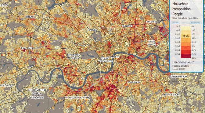
There are some similar tables: looking at Household Composition and excluding one-person and one-family households, as well as those with dependent children, or entirely composed of students or over 65s, look like this:
DataShine: Census
DataShine: Census is the first product of BODMAS’s DataShine toolkit. We have taken the Quick Statistics aggregate tables, released for the 2011 Census by the Office of National Statistics. We are using two geographies for these – Output Areas, which have a typical population of around 150-200 people, and Wards, which, being a political rather than statistical unit, vary more in population but typically have around 7000 in each. Wards have the advantage of having real names rather than numbers, and are manually designed to surround contiguous communities. As you zoom in and out of the DataShine Census maps, you’ll see the geographies change – Wards are simpler (so faster to create the maps) and because of their larger populations, have less of a patchwork look, particularly for datasets that have a very low average value or high variation.
The DataShine Census maps are generally maps showing the variation in percentages of a general population that fall into the selected category type. We have removed a small number of different maps in the dataset – such as population density – although hope to have these included in due course. We have also not, at this stage, included the Scottish and Northern Irish datasets, as these come as separate files. Again, we hope to have these in DataShine Census in time.
We decide how to map each data table based on the average percentage (for the current geography) and the standard deviation of the percentage values. Many census variables have very small average values (less than 1%) and standard deviations of the percentage and so are mapped as multiples of the average, or location quotient (LQ). For example, an LQ of 6 indicates the local area has six times the proportion of people (or households) in the selected category, than the England/Wales average for that geography. Other strategies are tried for different kinds of data.
