London Houseshares

qs116ew0012_london

London is a significant destination for many people at various lifestages. One particularly popular inflow is university graduates looking for a place to live as they start their first career-minded job in the capital – coming from the other 100 or so universities in the UK outside London, or from Europe or elsewhere.

It is often a rush to find somewhere to live, as it’s hard to get time off to search for houses when starting on a graduate career. London is also a very expensive place if you do not have an established income and have not yet received your first pay cheque!

So, many people start in the capital by sharing with friends, fellow interns, or other people in a similar situation. There is a significant geographic clustering in where these people live, and they are quite easy to spot in a couple of Census tables. They likely live in places which are not right in the centre of the city (too expensive) but which are well connected to the City and the West End (the major sources of graduate employers) by tube or other transport. Above all, they are likely places with an established nightlife, with bars and clubs, to ease the transition from university life to a professional career, and help people find their feet.

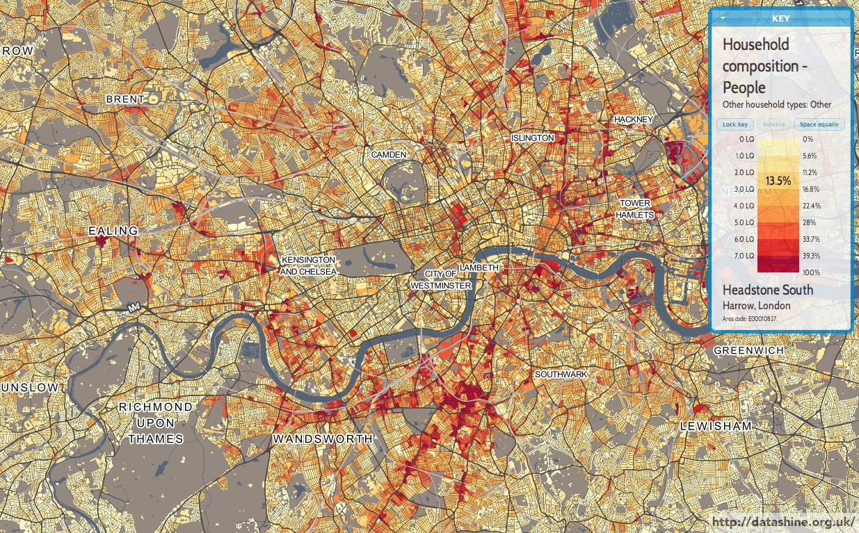
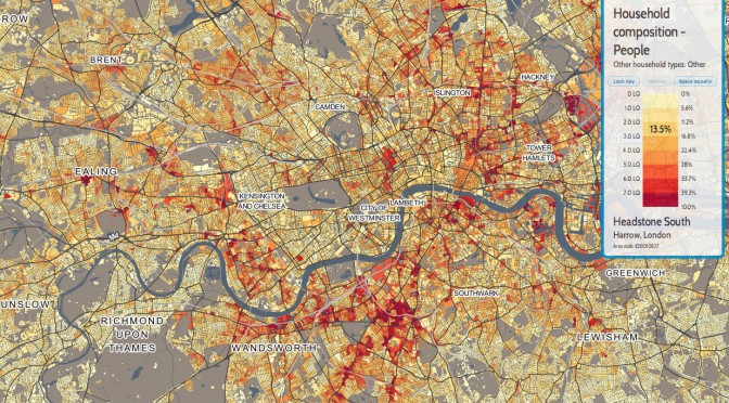
Above is a map showing multi-person households where not all those in the household are students or married/cohabiting. The highest values, where over 20% of households in an area fall into this category, are shown as dark red. In some places, such as parts of Clapham, Whitechapel and Hackney Wick, the figure is over 40%. Other popular areas are Fulham, Balham, Shoreditch and Dalston. All places with a high number of bars and a mix of nightlife and residential blocks.

By contrast, further out areas – Bromley, Bexley, Enfield, Kew – see very low percentages. There is also a noticeable dip in Kensington & Chelsea – nice and central, but almost all places here are likely far too expensive for the majority of those just starting out in London.

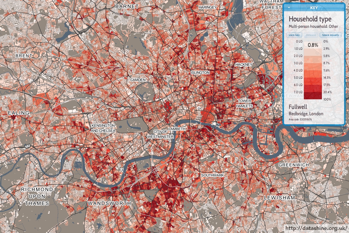
You can see an interactive version of the map here.

There are some similar tables: looking at Household Composition and excluding one-person and one-family households, as well as those with dependent children, or entirely composed of students or over 65s, look like this:

qs112ew0031_london

DataShine: Census

DataShine: Census is the first product of BODMAS’s DataShine toolkit. We have taken the Quick Statistics aggregate tables, released for the 2011 Census by the Office of National Statistics. We are using two geographies for these – Output Areas, which have a typical population of around 150-200 people, and Wards, which, being a political rather than statistical unit, vary more in population but typically have around 7000 in each. Wards have the advantage of having real names rather than numbers, and are manually designed to surround contiguous communities. As you zoom in and out of the DataShine Census maps, you’ll see the geographies change – Wards are simpler (so faster to create the maps) and because of their larger populations, have less of a patchwork look, particularly for datasets that have a very low average value or high variation.

The DataShine Census maps are generally maps showing the variation in percentages of a general population that fall into the selected category type. We have removed a small number of different maps in the dataset – such as population density – although hope to have these included in due course. We have also not, at this stage, included the Scottish and Northern Irish datasets, as these come as separate files. Again, we hope to have these in DataShine Census in time.

We decide how to map each data table based on the average percentage (for the current geography) and the standard deviation of the percentage values. Many census variables have very small average values (less than 1%) and standard deviations of the percentage and so are mapped as multiples of the average, or location quotient (LQ). For example, an LQ of 6 indicates the local area has six times the proportion of people (or households) in the selected category, than the England/Wales average for that geography. Other strategies are tried for different kinds of data.

DataShine Maps

DataShine is a toolkit for creating web maps for showing geographical data that has been collated and analysed by the BODMAS project, based at UCL’s Centre for Advanced Spatial Analysis, such as the 2011 Census data included in DataShine: Census that we have released today.

The DataShine System

There are two main components to DataShine – the map tiling system and the map-based website that you see in a browser.

1. Map Tiling System

The map tiling system is a number of Python scripts, which generate maps of geospatial data stored in a PostgreSQL/PostGIS database, using Mapnik. The maps are generated either as square PNG images of simple but colourful choropleths, often known as “tiles”, for display on the website, or as A4 downloadable PDFs with keys and other adornments (example below), suitable for printing. These are done ‘on-the-fly’ by invoking the Python scripts via the web server.

The map tiling system was also used to create the “context” maps. The data used here is mainly Ordnance Survey Open Data – using Vector Map District for the most detailed zoom levels and Meridian for smaller scales. Mapnik’s new compositing effects are used to show the buildings as transparent, “knocked out” areas of the map. When the choropleth layer is placed behind the context maps, the colours “shine through” the buildings – hence the name DataShine.

This is a style of mapping that has advantages and drawbacks. The key advantage is that, by only showing the data in areas where there are buildings, we don’t allow areas of low population (parks and the countryside) to dominate the map, but instead areas of high population draw the eye. The chief drawback is that the dataset used includes all buildings, such as industrial units, farm sheds, stadiums and shops, where people don’t live – but that we are typically showing residential information. The other major issue is that the inclusion of individual building blocks can imply a false level of detail – in other words, it can look like the colour/value shown on a house is relating to that particular house, rather than being an average for the local area.

We are also creating vector data, to show the underlying numbers and metadata (e.g. area name) for the map. This is also carried out in Mapnik, using a format called UTF Grid which creates “tiles” of value fields that are then picked up by the browser and show as you move the cursor around the map.

2. DataShine Website

Screen Shot 2014-06-16 at 16.42.42

The website is Javascript based, its focal feature a “slippy map” that covers the whole site, with user interface elements placed on top.

The core libraries used are OpenLayers, a powerful and flexible mapping library, and JQuery, a rich framework for enhancing Javascript. JQuery UI provides the styling and functionality for some of the visual “widgets”.

Building with DataShine

We are aiming to have the following features in our DataShine-based maps, where-ever possible and appropriate:

  • HTML5-compliant
  • A consistent look and feel, with user interface elements contained in a small number of widgets that float on the map.
  • Using auto-updating URLs so the current view can be easily shared and recreated.
  • Social media buttons and metadata to allow for effective sharing.
  • Viewable and usable on mobile devices (e.g. iPhones and iPads)
  • Not requiring external plugins.
  • Using browser geolocation to start the map near you.
  • Using a simple postcode search or key city “jump buttons” to allow you to go quickly elsewhere.
  • Aiming to minimise the number of clicks and time needed to get to the data and view you want.
  • Making the map the dominant part of the website, so you can see a larger area at once.

We hope to open-source as much of the DataShine code as possible in due course.