Local Area Rescaling and Data Download

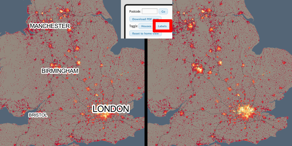
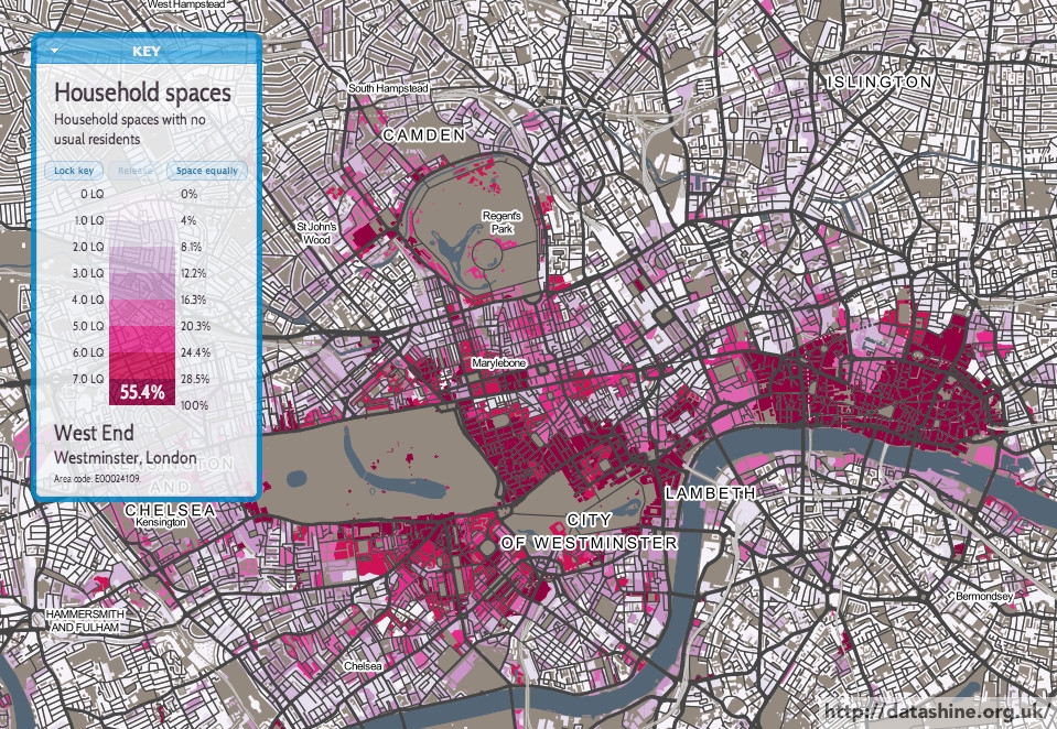
DataShine Census has two new features – local area rescaling and data download. The features were launched at the UK Data Service‘s Census Research User Conference, last week at the Royal Statistical Society.

Local Area Rescaling

This helps draw out demographic versions in the current view. You may be in a region where a particular demographic has very low (or high) values compared to the national average, but because the colour breakout is based on the national average, local variation may not be shown clearly. Clicking on the “Rescale for current view” button on the key, will recolour for the current view.

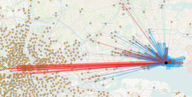
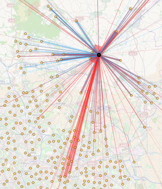
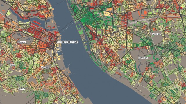
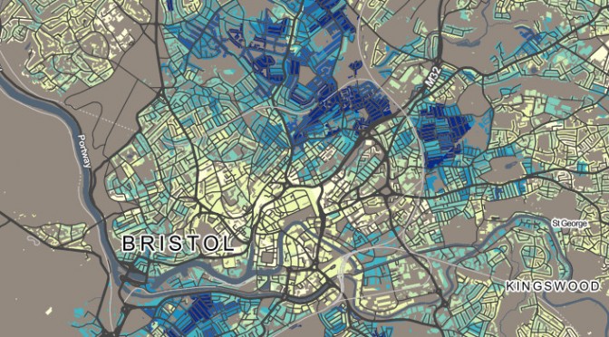
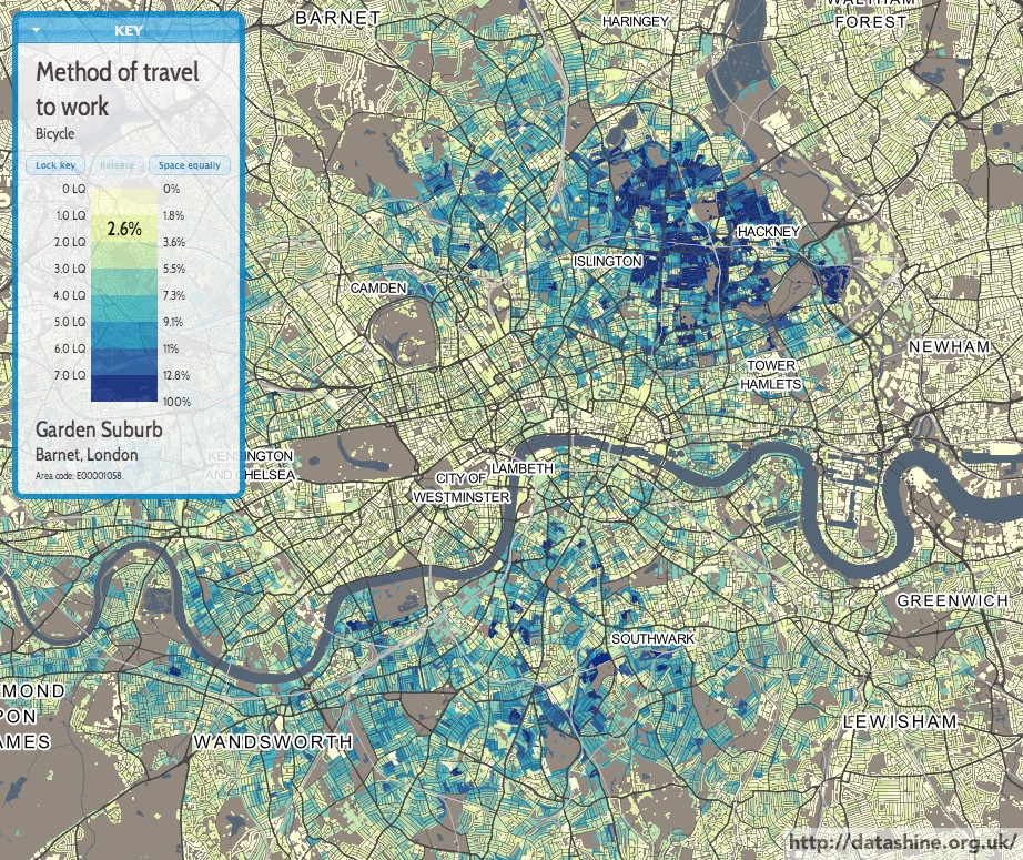
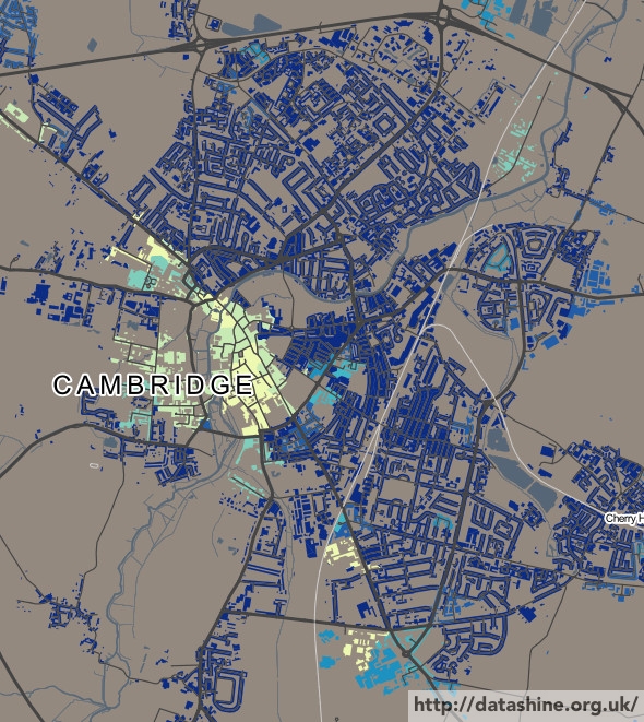
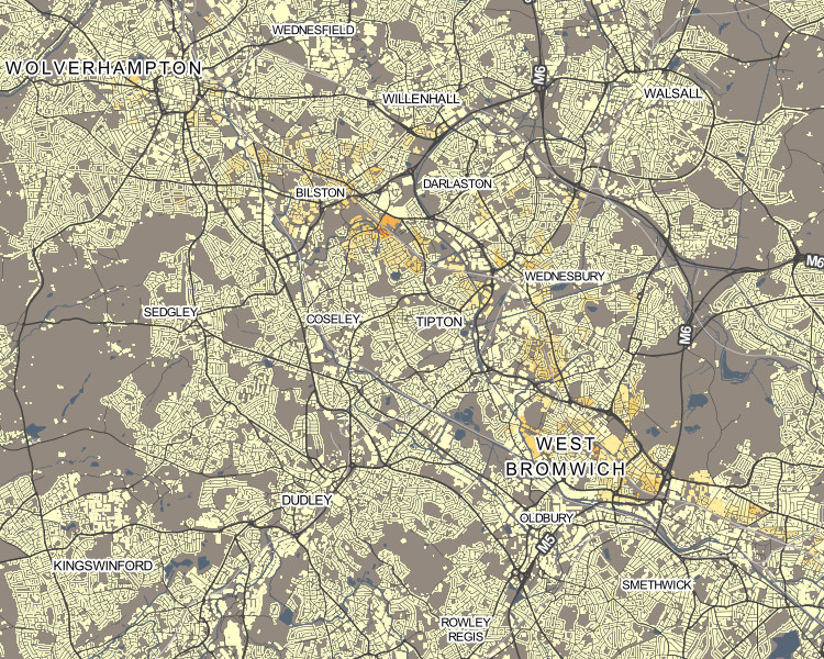
For example, the popularity of London’s underground network with its large population, means that, for other cities with metros or trams, their usage is harder to pick out. So, in Birmingham, the Midland Metro can be hard to spot (interactive version):

metro1

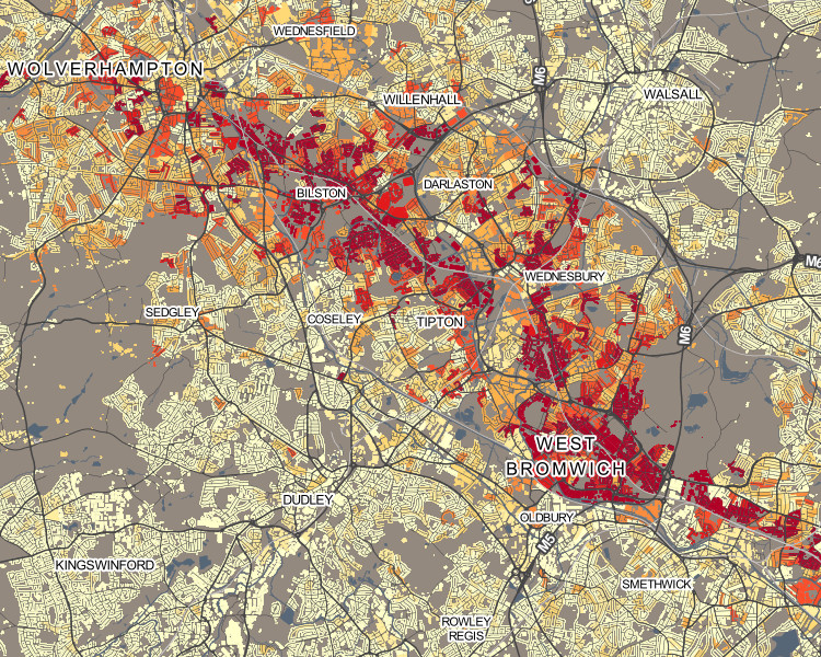
Upon rescaling, just the local results are used when calculating the average and standard deviation, allowing usage variations along the line to be more clearly seen:

metro2

As another example, rescaling can help “smooth” the colours for measures which have a nationally very small count, but locally high numbers – it can remove the “speckle” effect caused by single counts, and help focus on genuinely high values within a small area.

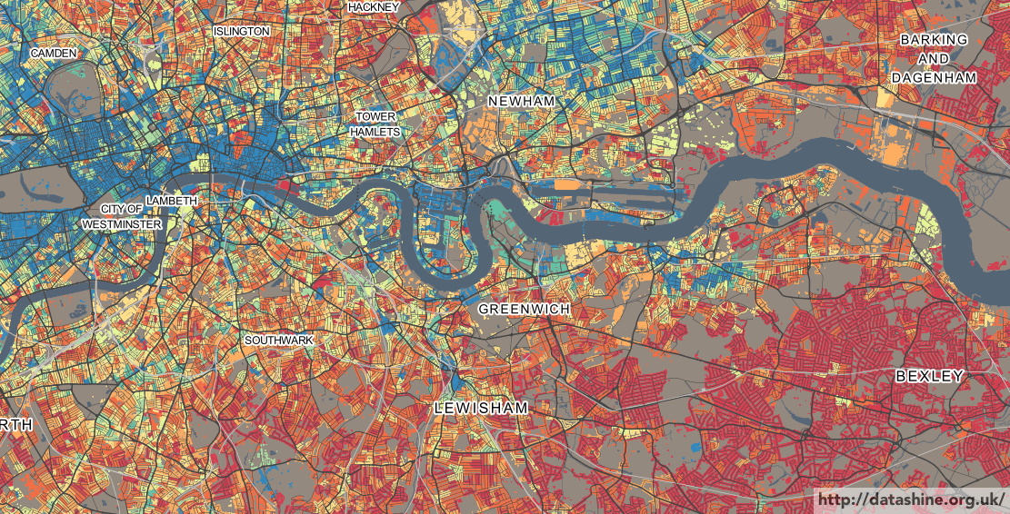
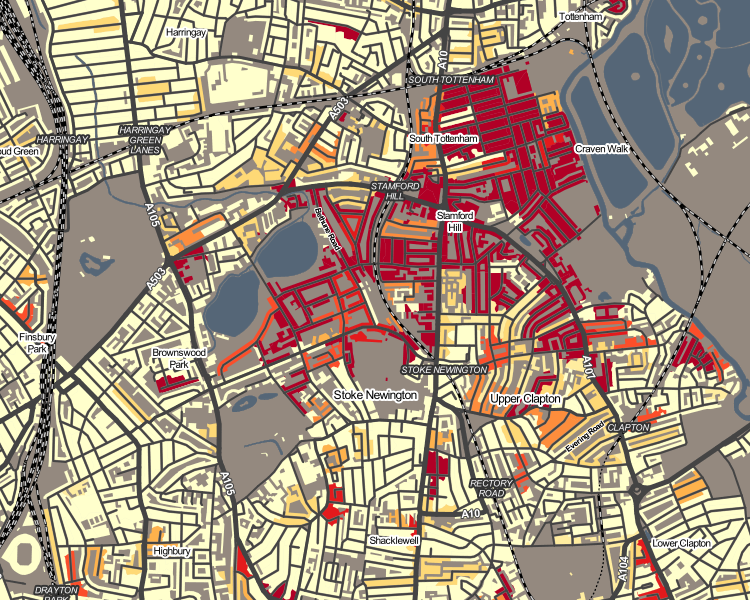
Hebrew speakers in Stamford Hill, north-east London (interactive version):

hebrew1

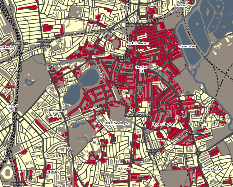
Upon rescaling, a truer indication of the shape of the core Hebrew-speaking community there can be seen:

hebrew2

Occasionally, the local average/standard deviation values will mean that the colour breakout (or “binning”) adopts a different strategy. This may actually make the local view worse, not better – so click “Reset” to restore the normal colour breakout. Planning/zooming the map will retain the current colour breakout. PDFs created of the current view also include the rescaled colours.

Data Download

On clicking the new “Data” button on the bottom toolbar, you can now download a CSV file containing the census data used in the current view. Like the local area rescaling functionality, this data download includes all output areas (or wards, if zoomed out) in your current view. This file includes geography codes, so can be combined with the relevant geographical shapefiles to recreate views in GIS software such as QGIS.

Next on the DataShine project, we are looking to integrate further datasets – either aggregating certain census ones or including non-census ones such as IMD and IDACI deprivation measures, or pollution.

DataShine: 2011 OAC

oac2

The 2011 Area Classification for Output Areas, or 2011 OAC, is a geodemographic classification that was developed by Dr Chris Gale during his Ph.D at UCL Geography over the last few years, in close conjunction with the Office for National Statistics, who have endorsed it and adopted it as their official classification and who collected and provided the data behind the classification – namely the 2011 Census.

A geodemographic classification such as this takes the datasets and looks for clusters, where particular places have similar characteristics across many of the variables. It does this on a non-geographic basis, but spatial autocorrelation means that geographic groupings do typically appear – e.g. a particular part of an inner city will typically have more in common with another part of the inner city, than of the suburbs. However, these areas will often also share much in common with other “inner city” parts of cities elsewhere. Names are then assigned, to attempt to succinctly describe the clusters.

As part of the DataShine project, we have taken the classifications, and mapped them, using the DataShine style of restricting the classification colouring to built up areas and (when zoomed in) individual rows of houses. The map is the third DataShine output, following maps of individual census tables and also the new Travel to Work Flows table.

We’re just mapping the eight “Supergroups”, the top-level clusters. A pop-up shows the more detailed groups and subgroups, and you can find pen-portraits for all these classifications on the ONS website.

Click on the box for an individual supergroup, in the key at the top, to see a map showing just that supergroup on its own. For example, here are the “Cosmopolitan” dwellers of London:

oac3

Like 2011 OAC itself, the map covers all of the UK, including Scotland and Northern Ireland. For the latter, there is no Ordnance Survey Open Data which is how I created the building/urban outlines, so I have improvised with data from OpenStreetMap and NISRA (Northern Ireland Statistics).

The map is part of DataShine, an output of the BODMAS project, but also is in conjunction with the the new Consumer Research Data Centre, an ESRC Data Investment which is being set up here at UCL and other institutions. As such, there is a CDRC version of the map.

As part of the BODMAS project we have also been studying the quality of fit of 2011 OAC for different parts of the UK, and techniques to visualise the uncertainty and quality of the classifications. We will be presenting these findings at the Uncertainty workshop at the GIScience conference in Vienna, later this month.

Direct link to the map.

DataShine: Travel to Work Flows

datashinecommute

Today, the Office for National Statistics (ONS) have released the Travel to Work Flows based on the 2011 census. These are a giant origin-destination matrix of where people commute to work. There are various tables that have been released. I’ve chosen the Method of Travel to Work and visualised the flows, for England and Wales, on this interactive map. The map uses OpenLayers, with an OpenStreetMap background for context. Because we are showing the flows and places (MSOA population-weighted centroids) as vectors, a reasonably powerful computer with a large screen and a modern web browser is needed to view the map. The latest versions of Firefox, Safari or Chrome should be OK. Your mobile phone will likely not be so happy.

Blue lines represent flows coming in to a selected place, that people work in. Red lines show flows out from the selected location, to work elsewhere.

The map is part of the DataShine platform, an output of the BODMAS project led by Dr Cheshire, where we take big, open datasets and analyse them. The data – both the travel to work flows and the population-weighted MSOA centroids – come from from the ONS, table WU03EW.

View the interactive map here.

lichfieldcommute

Labels!

labels

The labels that appear on the map add some context, and help you find out where you are, but we realise that sometimes these labels can be less than helpful, and can obscure the data. With this in mind, we have now added a “Labels” button, beside the “Buildings” button, at the bottom. Clicking this will toggle labels off/on. The setting also extends through to the PDF creator functionality.

Try it out here.

DataShine Website updates

DataShine has been out for around a week now, and we’ve made some changes to fix small bugs.

Specifically:

  • DataShine should work much better in Internet Explorer 9 now, as we now prompt this browser to use compatibility mode, with which the website displays correctly.
  • When showing a dataset that diverges around the mean, we always switched to the red/green divergent colour set, even if another colour set was specified in the URL. We now keep track of this and other manually specified colour changes, and stop the auto-changing in these cases.
  • We truncate long category names more aggressively now, so that they don’t spill out of the end of the data chooser even in browsers that use larger text for drop-downs.

Pro-Tip: Specifying your own Colour Ramp

DataShine: Census uses ColorBrewer for its colours ramps. There are six ramps provided by default, which can be selected at the bottom of the website – five sequential ones and one diverging one, which is used for many maps where the standard deviation on the percentage population is a lot lower than the population percentage average (i.e. things which don’t vary a lot.)

You can change to your own one by specifying the ColorBrewer ramp code in the appropriate place on the URL of DataShine Census, e.g. &ramp=YlOrRd. Note that if you specify one of six ones at the bottom, then it may still switch to the default sequential or diverging one. But for any of the many others available, this will not happen.

The picture here is using the “Spectral” colour ramp. This is a diverging colour ramp, best suited for showing variations on either side of the average, so we are somewhat misusing it here, as here only the darkest red colours represent below-average values.

Live example.

Holiday Homes?

qs417ew0003_newquay

The south-west is known as a place where there are many second homes. In some villages, so many of the homes are empty for much of the year, or are simply holiday homes, that living there can seem even quieter than you would expect.

Above is Newquay, the capital of surfing in the south-west and a place that shows a huge variation the proportion of houses “with no usual resident” as you move across the town from east to west.

“Prime Central London” is a strange place, where the super-wealthy buy homes but then don’t necessarily live in them. The boundaries of Prime Central London can be seen quite sharply – with the proportion of homes that are often empty falling away quickly as soon as soon as “real London” is encountered.

Interactive version.

qs417ew0003_london

Cycling to Work

Cycling to work is on the increase but is at very low levels in most places in the UK – and there are very wide variations, even across towns and cities of similar size.

Bristol (above) and London both see zones of high usage – typically in inner city suburbs popular with students and graduates:

qs701ew0010_london

Cambridge has near universal popularity for cycling, except right in the city centre where everything is in walking distance:

qs701ew0010_cambridge

Luton is close by, and similar to, Cambridge, but virtually no one cycles, in any part of the town:

qs701ew0010_luton

You can see the cycling map for your local area here.